Common Works was approached by Matt Webb to brand and create assets for Machine Supply, a bookshop in a vending machine which is stocked based on recommendations from a Twitter community.
We began by discussing with Matt his vision for the project, which up until that point had no branding at all. He explained how he wanted the aesthetic to be influenced by ‘New British Modern’ – a research document created by Matt Brown (previously of BERG) – citing British Steel and The London Overground as inspiration. We wanted a look more in keeping with the branding of the publishing houses that appear on the books inside the vending machine and less like that of a tech startup. The branding was to include a mark, various printed materials and a bootstrap for a website.

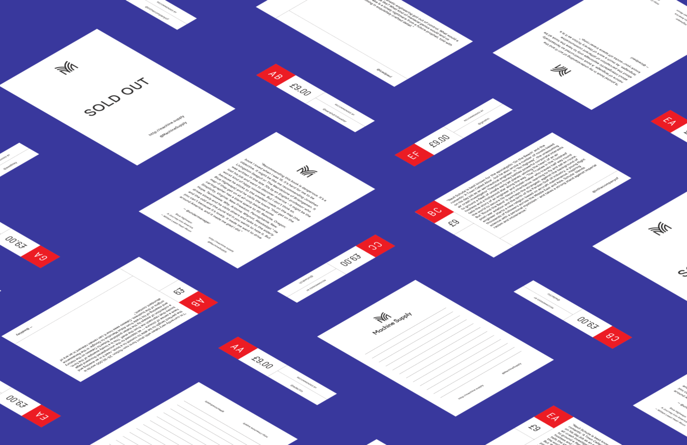
Mockup showing recommendations on books
We created a document filled with reference material in keeping with the desired aesthetic to get a better understanding of the visual language. As the printed material would need to be updated regularly to accommodate new stock, we also researched shelf-talkers, train/plane tickets and various grid systems to aid us in building a system to deal with the content provided by reviewers.
From this reference material we started to sketch ideas for marks. We began this process by drawing icons that were either very literal representations of books, combinations of the letters “M” and “S” or different symbols that implied that the project was connected and IOT. We filled pages with different ideas that fell under one of those categories before deciding that a capital “M” which could also represent an open book was the right route to follow. We drew various versions of this idea that, again, were very literal, before reducing and simplifying it down to a more abstract and striking icon.

A selection of initial mark ideas
The evolution of the logo, from a crude 'M' mark, to a more detailed book, to the final more abstract mark
The grid system for drawing the final mark
We then looked at typography and printed material. We experimented with different typefaces, looking for a combination that suited both the necessary information needed to go on the shelf-talkers (price, keycode) and the lengthier text for the reviews. We eventually decided on Static – a typeface that resembled some of the more informational elements on ticket stubs from our research – and Relative – a slightly quirky sans-serif that would feel at home on the cover of an old Penguin Crime series. The printed material needed to be printable from a standard desktop printer as it changed so frequently. To accommodate this, we created a series of templates that were automatically populated — from a webpage — by the reviews as well as the book and user information.
Matt also expressed an interest in creating a reward for people who submitted reviews. For this we created an enamel badge of the logo.

Specimens of the typefaces we used

The layout for the shelf talkers is inspired by the Marber grid used by Penguin.
An enamel badge was made as a reward for reviewers
For the colour palette we devised a scheme that used quite punchy bright colours, although the branding stipulated that only one colour should be used in any one situation e.g. green, black and white. We did, however, make a secondary version of this ‘Pristine’ palette called ‘Faded’, which showed each colour as if it had been printed on a book cover and had faded over time. This was to provide contrast to the main palette if an additional colour was needed.

The two versions of the colour palette.
The vending machine toured across London including stints at Google Campus, Machine Room and, I lost My Name HQ.